Quick Web Accessibility Tip
Published on:
A web accessibility tip that is about color contrast. Chrome DevTools makes this easy.
The Tip
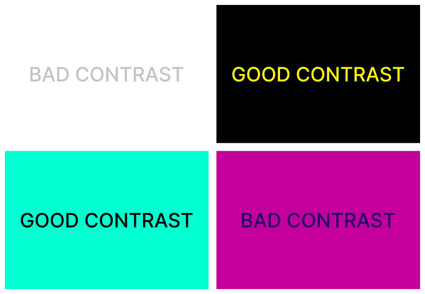
The issue I see on lots of websites and apps is the lack of using good color combinations. I am not referring to the overall color palette, but to the background and foreground colors. The issue is with their contrast ratio. Color contrast ratio is a numerical value that represents the difference in light between the foreground and the background. A low contrast ratio results in a less or completely non-readable text.

Keep a good contrast ratio everywhere on your site. It’s the easiest thing to do.
DevTools
Chrome DevTools can help you with contrast ratio. Use CSS Overview or Lighthouse to see if you have any color contrast ratio issues on your site.
Previous Part
Small Web Design Nuggets
Next Part

